Continuing yesterday's summary of my comments from the Connections conference, here are some thoughts on Chron.com, the Web site of the Houston Chronicle:
- The left-rail navigation is alphabetical. Several usability studies have said such navigation lists are harder to use than normal (categorical) lists. (I've discussed this topic previously.)
- It's great to see the clearly labeled last-updated time at the top of the home page. It'd be even more helpful (for non-U.S. readers) if the acronym "CST" were explained. There's no doubt people in Houston will know it means "Central Standard Time," but readers from other parts of the world -- visitors from Australia who stumble upon chron.com via a Google search, for instance -- might not. "CST" is a prime candidate for the
<acronym>tag (as previously discussed); or, better yet, the word could be linked to a page explaining this particular time zone in depth, and providing a means for users to convert their own time zone to Houston's.  At the top left of the home page, I see three links: "ARCHIVES", "MAKE THIS YOUR" and "HOME PAGE". I pity the user who clicks that third line, thinking it's a link to the home page. These small annoyances pile up quickly.
- On the lower right of the entertainment page, what's the difference between "Extras" and "Specials"? I'm sure the Chron.com producers know how they differ -- but, at face value on this Web page, they look to be the same thing. Some more descriptive keywords would help.
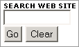 The home page's basic, one-field search box has a "Clear" button -- a practice often discouraged because it causes more trouble than it's worth. Particularly for a one-field form, a "clear" button is unnecessary.
- On the home page, the labels "Today's top stories" and "Other news" are unnecessary; they communicate nothing that the visual design itself doesn't. And the former occupies precious screen real estate.
Comments
Posted by anonymous on December 24, 2005, at 1:16 a.m.:
I don't know who had the bright idea to change up the Chronicle website. The new colors are terrible. Now I have to search all over the place to find what use to be on the home page. Bring back the old format!