I'm back from the Connections conference, and I've Web-posted my introductory presentation, which was a quick rundown of Web design pointers.
During our panel discussion, Jay Small and I critiqued the design of two news sites. Jay focused on the important stuff; I made annoying/nitpicky suggestions. Here's a sampling of some of the comments I made about northbay.com:
- The top of the home page has three search boxes -- a potentially confusing practice. Two of them (the left and right ones) point to the same search engine; it would clear up confusion if one of those were cut out. Until that happens, befuddled users might assume each search box searches a different part of the site, and, hence, might attempt their searches twice -- only leading to wasted time and frustration.
- Similarly, all three search boxes have a link to "Advanced Search."
- The left-rail navigation uses the word "More..." to give readers an explicit link to more content in each particular section. Many news sites stop short of this technique, linking only the section name itself to "more" content. Northbay.com's way is much better: Here, redundancy helps.
- It'd be helpful if today's date were labeled on the events calendar. And the "S," "M," "T," etc., shouldn't be underlined if they aren't links.
- Like many other news sites, northbay.com displays an ambiguous date on its home page. (I discussed this in depth several months ago.) Is it the last-updated date? Or is it simply today's date? Some short explainer text would help.
- The "North Bay Top 10" section on the home page makes excellent use of underlining "important" words. This makes for easy scanning, and is better than linking the categories (e.g. "Drama") or, God forbid, using the words "click here."
- On the section fronts (such as the Food and Wine page), headlines should be clickable. My friend Nathan Ashby-Kuhlman has written an excellent piece on why this should be done.
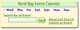 Also on the section fronts, the events-calendar search box in the upper right is somewhat confusing. How do the days of the week (in blue) correspond to the search box? Does the green arrow next to "Wed" mean the search will be limited to Wednesday's events? This isn't the case, but the graphical grouping of these two elements suggests otherwise. I'd move those dates out of the box, in order to isolate the search form.
- The left-rail navigation mixes content-types and content-subjects. For example, in the "Entertainment" section, we see links to "Articles & Columns" (two types of content) and "Books" (a subject of content). This begs the question: Which link do I click if I'm looking for an article about books? It'd be less confusing if the navigation stuck to either type-based or subject-based sections, across the board.
I'll post my comments on the second critiqued site (the Houston Chronicle) tomorrow.
Comments
Posted by Jay Small on January 30, 2003, at 8:04 p.m.:
Heh ... there's a difference between detail orientation and being "nitpicky." I found your critiques very useful, and I'll bet you'll see changes on the two sites based on what you said.
Nice to meet face-to-face, finally, too. Thanks!
Posted by Adrian on January 30, 2003, at 10:03 p.m.:
Thanks, Jay. :) Here's hoping we'll meet on a panel again some time soon.