Since I'm usually busy Fridays, I'm going to start a weekly "screenshot" feature instead of Friday's site review. (Monday and Wednesday site reviews will continue.) Each week, I'll post a screenshot of a particular feature on one or more news sites. It'll be either a model I think should be followed or an example I think should be avoided. My comments might range from nitpicky to general; either way, I'll try to present features we all can discuss, learn from and be inspired by.
Today's screenshot is of the home page of NewsChannel2000.com, which redesigned this past week. It's their list of links that appears in the right-most column:
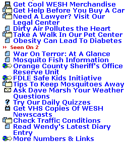
I want to point out two things about this list, one good and one bad.
The good: Those icons are styled with style sheets; they're not hard-coded in. This is accomplished here by wrapping the link in a DIV tag and setting the DIV's background image to the icon. Here's the relevant code for the first item in the list:
<div class="computerlink"><a href="http://www.link.com/" class="iconed">Get Cool WESH Merchandise</a></div>
The div class="computerlink" corresponds to this piece of CSS code:
.computerlink {background-image: url('http://images.ibsys.com/2001/0126/435589.gif'); background-repeat: no-repeat;}
Note that this can be rewritten to background: url('http://images.ibsys.com/2001/0126/435589.gif') no-repeat;.
The background-image attribute sets the icon, and background-repeat is set to "no-repeat" so that the icon only appears once. Otherwise it would be tiled under the link repeatedly, looking like this:
![]()
The class="iconed" code pushes the link text over to make room for the icon. Here's the relevant CSS:
.iconed { padding-left: 22px; }
Without that left margin, the text would overlap the icon, like so:
![]()
The advantage of using style sheets this way is: If the NewsChannel2000.com producers ever want to change that computer image, all they'd have to do is change one CSS file to make the change sitewide. Plus, it saves bandwidth, because the code is more compact.
The bad: OK, so the icons are styled in a relatively innovative way. But what the heck do they mean? What's the difference between the computer, the file folder and the page with a corner bent? And what's that globe pointing to? The question mark is obvious, as is the envelope, but the rest of the icons are blatantly unusable. This is an entry for the Interface Hall of Shame if I ever saw one. In the name of fairness, I tried to find a site FAQ page of some sort, but I couldn't find out, anywhere, what those icons mean. If anybody has any ideas, please post a comment and enlighten us all.
Comments
Posted by Jay Small on August 20, 2002, at 11:07 p.m.:
Another complaint, though this one's a niggle -- wouldn't it be nice to breathe a pixel or three of vertical space between each item in the list? The various icons alone don't serve as effective bullets to separate the thoughts reflected in the text. Too jumbled.
Posted by Adrian Holovaty on August 20, 2002, at 11:22 p.m.:
I agree, and I should've pointed that out -- especially because, in the example above, each word is capitalized. That makes it even easier to mistake a wrapped line for a two separate links. (For example, one might think the fourth line is an independent link to "Legal Center".) More space would definitely help.