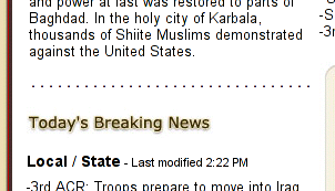
Gazette.com, a newspaper Web site of Colorado Springs, Colo., uses dotted horizontal lines to separate content sections on its home page, like this:

Those dots? They're hard-coded periods and spaces. Using plain-text characters to represent graphical elements in such a way is a poor Web-design technique.
A better solution (besides abandoning the dotted line in favor of good ol' white space) would be to use a CSS border-bottom on the page element directly above the line, or a border-top on the element directly below it.
Why even bother with such a minor tweak? Four reasons.
- Principle. Design should be separated from content when possible and feasible. In this case, it's both.
- More design control. Using CSS, a designer can easily tweak the line's type, thickness, color and position.
- Uniformity across media/browsers. In a typical, graphical browser such as Internet Explorer -- which, no doubt, the vast majority of the site's visitors use -- set to its default font sizing, the dots span the column perfectly, with no overlap. (See the above screenshot.) But, increase your browser's font (or "text zoom"), and the dots will wrap to a second line -- and, possibly, a third. Likewise, the dots wrap in small-screened handheld devices; such devices would be better served by markup that isolates presentational code. It's tiny things like this that add up to an unpleasant browsing experience on handhelds.
- Accessibility. From what I've read, screen readers interpret periods as "pause" characters. It follows that a line full of periods could very well be interpreted as a single, ultra-long moment of silence. (Accessibility experts, please chime in.)
Comments
Posted by BenM on April 24, 2003, at 11:41 a.m.:
I've just visited the site, it is atrocious. I don't have my machine with IBM homepage reader at the moment but I tried it with Microsoft's narrator screen reader. It is worse than just a series of pauses, it pronounces each period by saying "period" about 20 times! lets code HTML like it's 1995!
Proper aural web browsers for those with visual problems may make a better job of it than narrator, but many people can not afford to buy them and stick with the default screen reading software they get.
Posted by Adrian on April 24, 2003, at 4:39 p.m.:
Oooh, Ben, thanks for the insight!
Posted by Elaine Nelson on April 24, 2003, at 5:12 p.m.:
Just to be contrariwise, I could see why you might not want to do it with CSS:
1) You can't control the spacing of the dots on a dotted border. (I wish you could!)
2) A dotted border shows up as a dashed border in IE 5.x
Of course, those are two damn weak arguments, esp. in light of the problems with using actual periods. (I suppose if one cared that much about my points, it'd make more sense to use the bullet character, or as you say, to use more whitespace.)
Posted by Adam Rice on April 24, 2003, at 7:46 p.m.:
The row of periods could and perhaps logically should be coded with the HR tag, which could be styled in CSS to look like whatever you want (using a graphic, whatever).
Posted by Elaine on April 24, 2003, at 8:17 p.m.:
oooh, maybe with a repeat-x background of dots, even. :)
Posted by John S. Rhodes on April 25, 2003, at 5:24 p.m.:
Maybe I am smoking crack, but it looks like they using an image now:
http://www.gazette.com/images/dotted_line.gif
Posted by Adrian on April 26, 2003, at 12:49 a.m.:
Huh. John, you're totally right. They must've changed it.
Posted by Dan Martin on April 26, 2003, at 4:25 a.m.:
There are many many things wrong with this site, but I guess you could chalk it up to inexperience. It seems as though the designer is listening if they changed the series of spaces and periods to an image.
I have been there myself though...I would hate to have some of my previous newspaper work critiqued here.
Posted by Kris on April 28, 2003, at 12:51 p.m.:
An image pattern of a dot, backgrounded through CSS, positioned at the top or bottom of one of these elements.
That is the solution that gives more control and includes all the advantages mentioned earlier.
Posted by Nathan Clark on May 1, 2003, at 11:26 p.m.:
A humorous (and outlandish) approach. Be sure to check the source.
Posted by prawnFresh on May 9, 2003, at 2:57 p.m.:
I did a test using my screen reader software. If you have dots (in my tests I used 21) and you place these dots next to each other, without using any spaces (e.g. ... ) then the screen reader will output it by saying “21 dots”. If however you place spaces in-between these dots, each and every dot will be spoken, so my software says “dot”, 21 times.
One thing I found whilst using the reader on your site is that in this article, where you have bullet pointed reasons for change, you have emphasised the first word. In the first instance you have used ‘1. Principle.’, however the period after Principle is not within the strong tags and so is read as, "Principle dot" with my screen reader. If you however placed the period within the tags, it would just read as "Principle" and would then provide a pause long enough, to tell the user that this was a listed item.
Something I though you may consider. By the way I used the IBM Home Page reader... which I think is free... and very handy! I recommend everyone get a copy (hefty download though (40megs))